I was standing in the tea aisle of my local grocery store last weekend, trying to pick between two boxes of Earl Grey. Same price. Same number of bags. Both organic.
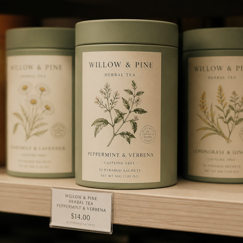
One box looked like it had been designed in Microsoft Word in 2003. The other had this beautifully minimal label — muted green, a hand-drawn bergamot illustration, typeface that felt warm but polished. I grabbed the second one without even thinking about it.
That’s when it hit me: the label made the sale. Not the tea. Not the brand name. Not a Facebook ad I’d seen three days earlier. The label, right there on the shelf, in that one-second moment of decision.
And that’s the thing most small business owners don’t spend nearly enough time thinking about.
Your Label Is Working Harder Than You Think
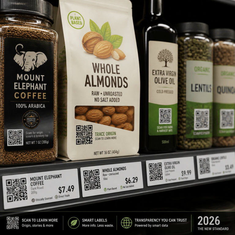
Here’s a number that stuck with me: according to a 2024 study by the Paper and Packaging Board, 72% of consumers say packaging design influences their purchasing decision, and for first-time buyers, the label is the brand. There’s nothing else to go on. No prior experience. No word-of-mouth recommendation. Just what they see in the three to five seconds they spend scanning a shelf.
If you’re a small business — whether you’re selling hot sauce, handmade candles, or consulting services — your label (or your visual identity more broadly) is the hardest-working member of your team. It doesn’t take breaks. It doesn’t call in sick. It’s there at 11 p.m. when someone’s doom-scrolling Etsy. It’s there on the farmer’s market table. It’s there in someone’s pantry, quietly doing brand recall work while they make breakfast.
And yet most entrepreneurs treat label design as an afterthought. Something you slap together in Canva the night before the product photos are due. I’ve done it myself, and I’ve regretted it every time.
The Three-Second Rule (And Why It’s Brutal)
Researchers at the University of Miami found that the average consumer spends about three to seven seconds scanning a shelf before making a selection. That’s it. You don’t get a paragraph. You don’t get a pitch. You get a glance.
In that glance, a good label has to do at least four things:
- Tell them what the product is. Sounds obvious, but you’d be amazed how many labels bury the product name under the brand name or get too clever with design. If someone can’t figure out what’s in the jar in two seconds, you’ve already lost them.
- Signal quality. This isn’t about looking expensive. It’s about looking intentional. A label that was clearly thought about signals that the product inside was thought about too.
- Say something about who you are. Are you playful? Premium? Eco-conscious? Minimalist? Your label’s color palette, typography, and materials are all sending these signals whether you meant to or not.
- Make them feel something. The hardest one. Warmth. Curiosity. Nostalgia. Trust. The best labels create a tiny emotional reaction in the split second before the rational brain kicks in.
Most labels manage maybe one of these. Really good ones hit all four. And when they do, the product practically sells itself.
The Trend Nobody’s Talking About: Labels Are Getting Weirder (In a Good Way)
We’re in the middle of 2026, and if there’s one label trend worth paying attention to, it’s this: the pendulum has swung hard away from the sterile, Instagram-optimized aesthetic that dominated the late 2010s and early 2020s.
I’m seeing more hand-drawn elements. More mixed typography — three or four fonts on one label, but somehow it works. More irreverent copy. QR codes that lead to playlists instead of ingredient lists. Labels with jokes printed on the inside of the peel-away layer.
Dieline, one of the leading packaging design publications, has been tracking this shift toward what they call “radical authenticity” — labels that feel like they were made by a person, not a branding agency with a six-figure retainer.
For small businesses, this is actually great news. You don’t need a massive design budget to create a label that feels human. You need taste, a clear sense of who you are, and the willingness to be a little bit odd. Odd is memorable. Polished and forgettable is the real risk.
The Small Things That Make a Big Difference
If you’re rethinking your product labels right now, here are a few things that cost little or nothing but make a real difference:
- Tactile finishes. Matte lamination, soft-touch coating, even a well-placed emboss — texture signals quality faster than any color choice. If your printer offers it and the cost bump is manageable, do it.
- Typography hierarchy. One strong headline font, one clean body font. That’s the sweet spot. Three fonts max. Any more and you’re in ransom-note territory.
- White space. I know it’s tempting to fill every square inch — there’s so much to say! — but white space is what makes the important stuff visible. Treat empty space as a design element, not wasted real estate.
- The back label matters. Especially for food and beverage, people do read the back. Make the ingredient list clean and readable. A little personality in the copy goes a long way — think Oatly, not a legal disclaimer.
- Consistency across your line. If you have multiple products, they should feel like siblings, not strangers who happen to share a last name. A unifying color system or layout grid accomplishes this cheaply.
The Bottom Line
You can spend thousands on ads, social media managers, and influencer partnerships — and you should, if that’s part of your strategy. But none of those things are with your customer at the exact moment they’re deciding whether to buy.
The label is.
It’s the salesperson that never sleeps. The brand ambassador that costs nothing after the initial investment. The one piece of marketing that people voluntarily put in their homes and look at every single day.
If you’re a small business owner, ask yourself: when was the last time you really looked at your label through the eyes of someone who has never heard of you?
If the answer makes you uncomfortable, that might be the most valuable realization you have all month.