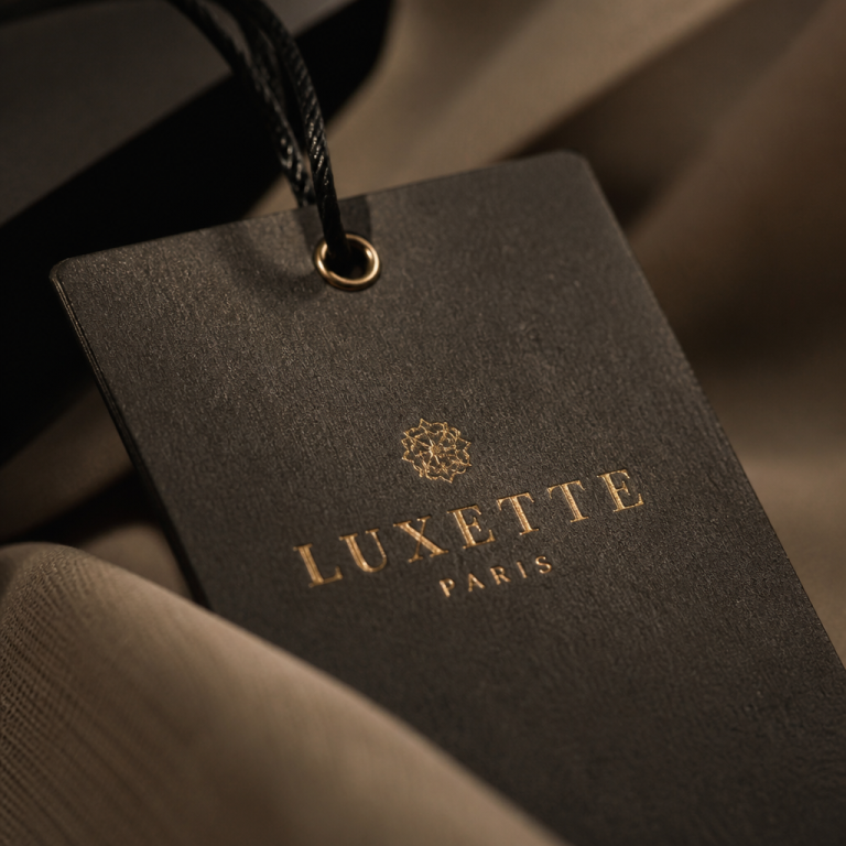
I remember unboxing a sample silk slip dress last winter—the fabric was liquid, the seams invisible. And then my finger brushed the care label, and it felt like sandpaper hidden inside a cloud. I actually flinched. It was a small thing, but in that moment, the whole garment lost its magic. That scratchy little polyester tag whispered a truth the price tag tried to hide: someone stopped caring before the very last stitch. It got me thinking about how much psychological weight a clothing label carries, and why the truly premium ones feel like a quiet love note rather than an afterthought.
The Handshake You Don’t See Coming
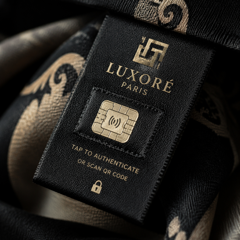
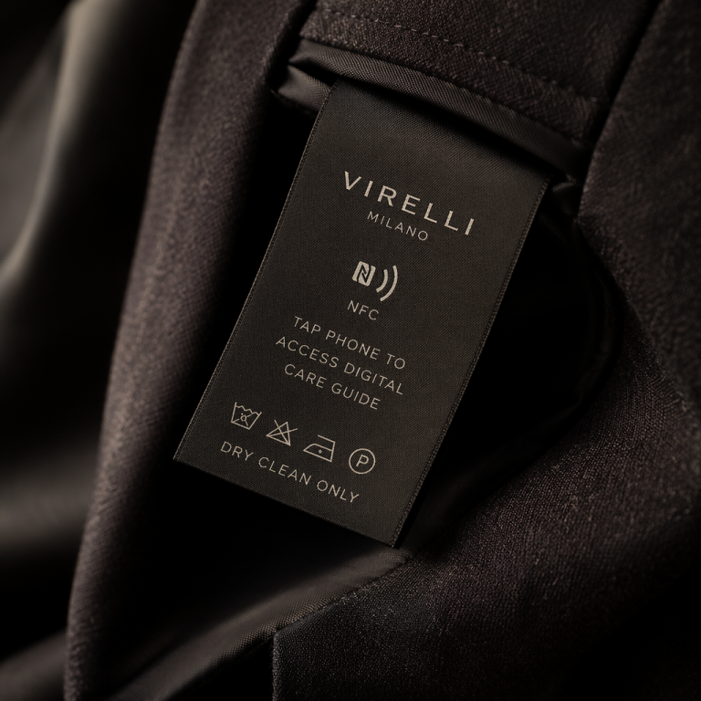
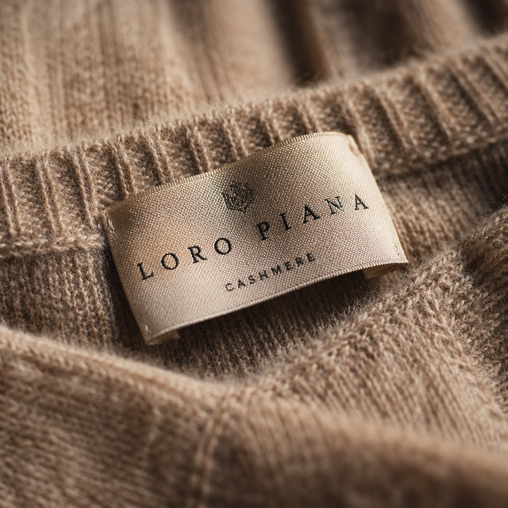
Luxury is never just visual. We’re tactile creatures—when we slip on something special, our hands are already conducting a silent interview. The first thing many of us do, consciously or not, is search for the label. Not to read the fiber content, but to feel how the brand has chosen to introduce itself. A stiff, shiny tag printed with slightly blurry ink feels like a handshake with a limp wrist. A woven damask label with a soft hand and deep, tonal embroidery? That’s a firm, warm palm that lingers.
Psychology plays a starring role here. We associate certain textures with intimacy and care—think of the gentle nub of high-count cotton sheets, or the weight of a vintage satin ribbon. When a label mimics those qualities, it triggers a sense of private luxury, the kind only the wearer knows about. It’s not for the outside world. That secrecy deepens the attachment. I’ve watched friends in a fitting room run their thumb over a label a dozen times, almost as a nervous comfort. The label becomes a talisman.
Brands that get this lean into materials that are absurdly soft, like micro-suede or a tight-woven textured cotton that almost feels like paper but never scratches. I once found a small Parisian label (no pun intended) that uses deadstock silk charmeuse for their tags, printed with vegetable inks. It felt like a secret I was being let in on. That’s the power: the label isn’t a practical necessity; it’s an emotional punctuation mark.
Materials That Make the Brain Sigh
Let’s geek out for a second on the actual fabrics. The most common mistake is thinking “soft” is enough. It’s about depth, light, and sound.
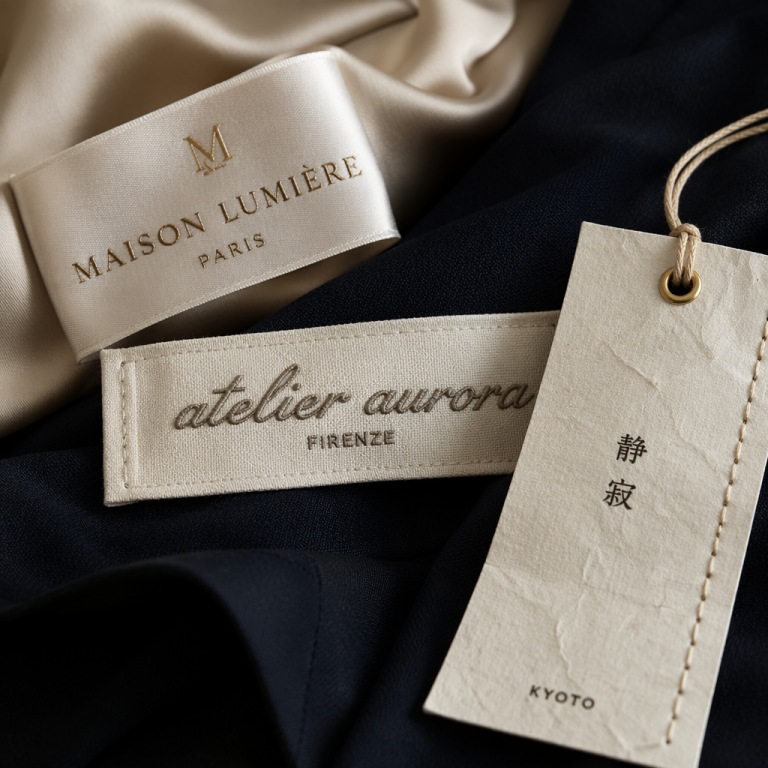
A high-sheen satin label can scream “luxury” in the worst way if it’s cheap—like a polyester prom dress pretending to be silk. But a matte satin with a subtle luster, the kind that catches light only when you move, feels expensive and discreet. Woven damask is a classic for a reason: its dense, almost velvety surface absorbs touch and light beautifully. It doesn’t reflect, it receives. Then there’s textured cotton with a soft peach finish—it’s the label equivalent of a well-worn linen shirt, immediately familiar and unpretentious.
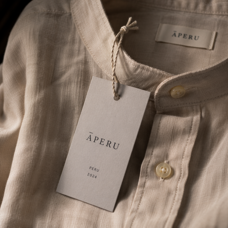
I’ve noticed that contemporary brands like The Row master this contrast: their labels are often a thick, off-white cotton with a barely-there raised weave. No shine, no shout. The luxury is in the restraint. On the other end, a heritage brand like Hermès uses that iconic jacquard weave that feels crisp yet forgiving—you want to hold it between two fingers because it has presence. It’s not just a tag; it’s a tiny textile artifact.
Sound matters too. A label that rustles like a candy wrapper kills the mood. The best ones are silent, or make a soft papery whisper that reminds you of flipping through a well-made book. Pay attention next time—your ears are part of the luxury test.
One Thing You Can Steal for Your Own Line
If you’re a designer or boutique owner, here’s a tiny, high-impact trick: match your label’s material to the lining or inner facing of the garment, but subvert the finish. For a wool coat with cupro lining, use a cupro label with a sandwashed finish—soft like a baby blanket, but still clearly part of the garment’s DNA. It creates a seamless tactile journey from the sleeve to the back neck. Your customer won’t be able to articulate why it feels so good, but they’ll remember it. And don’t overprint. Let the weave do the talking.
The Luxury That Lives in Your Hand
Here’s the thing I keep coming back to: a premium label isn’t about showing off. It’s about the private moment between a person and the thing they chose to wear. When you touch a label that feels like it was made by someone who cares—someone who considered the temperature of your skin, the sensitivity behind your neck—you feel held. Not marketed to. Held.
I think that’s the real psychology at work. We crave connection, even in the smallest, most overlooked corners of a garment. A rough label breaks the spell. A beautiful one becomes a little secret you carry all day, a reminder that someone out there still believes in doing things with soul. Next time you’re choosing labels for your collection, pick up the sample, close your eyes, and just feel. If it doesn’t make you smile, go back to the drawing board. Your customers will feel the difference, even if they never quite know why.