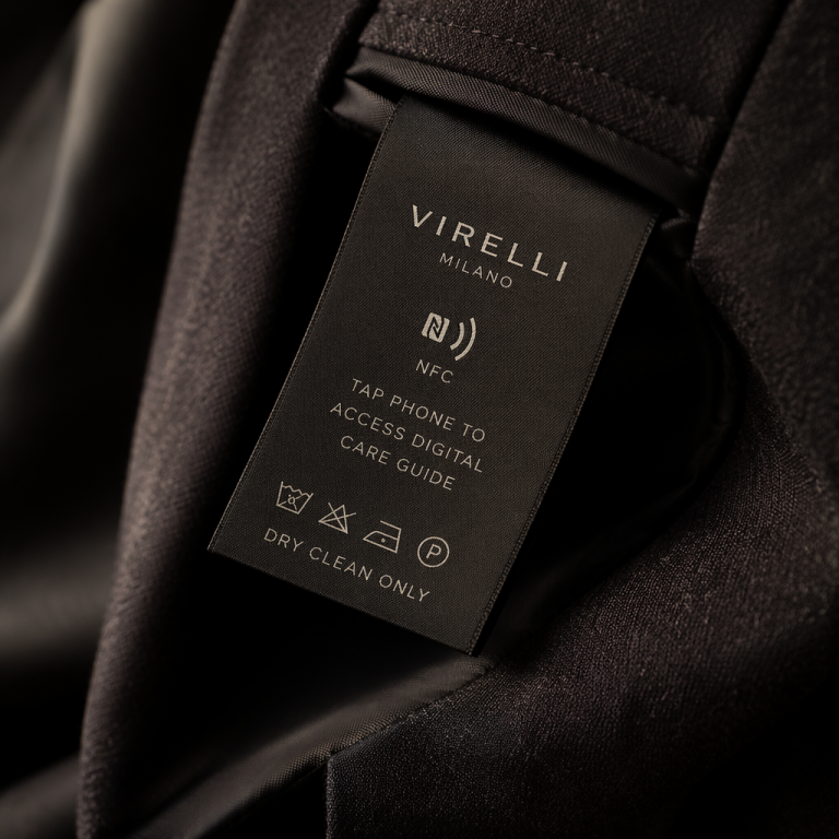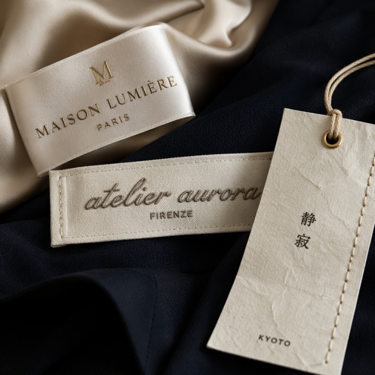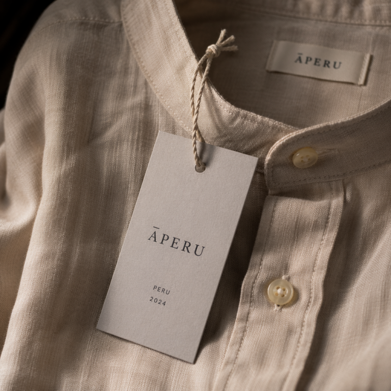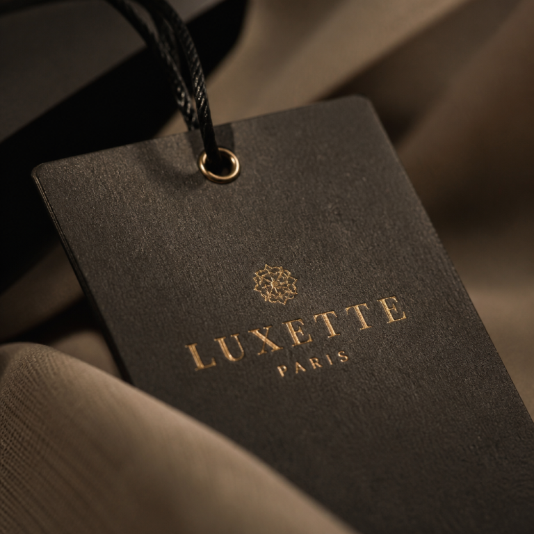
Last month, in a sunlit corner of a Parisian concept store, I turned a charcoal cashmere coat inside out and discovered something unexpected: almost nothing. No glossy satin, no serial number shouting for attention, just a whisper-thin strip of tonal thread reading “Lemaire” in the tiniest serif type, blind-embossed onto the fabric’s reverse. It was a stark contrast to the jacquard billboards that most high-street brands stitch into their linings. In that silent moment, I realised that for the world’s most refined minimalist labels, the garment tag isn’t an afterthought—it’s a critical articulation of their entire design philosophy. When clothes are reduced to their essential lines, every detail matters, and the label becomes a discreet signature that either elevates the piece or quietly undermines it.
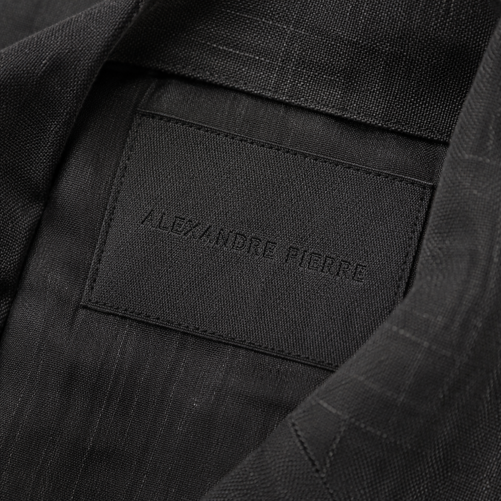
The Philosophy of Reduction: Why Minimalist Labels Exist to Disappear
True luxury minimalism isn’t about absence; it’s about intentional removal. Every seam, button, and stitch earns its place, and the label is no exception. The most celebrated minimalist houses treat the label not as branding real estate, but as an organic extension of the garment. The Row, for instance, is legendary for its almost invisible identification: a tiny cream rectangle sewn into a side seam, with the name rendered in a hairline serif font so delicate it feels handwritten. It’s a design decision that understands the psychology of the wearer. The person who invests in a £3,000 double-faced cashmere coat doesn’t need a logo to announce provenance; they want the experience of discovery, a detail that only they know exists.
This approach accelerated with Phoebe Philo’s return to fashion, where her eponymous label delivers garments with absolutely no overt branding—often using only a removable hang tag or a subtle deboss on the interior leather patch. Jil Sander, the godmother of modernist minimalism, long ago pioneered the use of tonal labels that sit flush with the lining, their matte finish absorbing light rather than reflecting it. For these brands, the label’s role is to document, not to advertise. The philosophy translates into three principles: the label should never compete with the silhouette, its texture should match the garment’s hand feel, and its placement should feel intuitive to the body, not an interruption.
The Material Dialogue: Choosing Label Fabrics That Amplify the Garment’s DNA
A minimalist label’s power lies in its materials. Mass-market tags often employ stiff polyester or shiny satin that scratches the skin and warps after washing. In contrast, high-end minimalist designers select label substrates with the same care they give to the outer fabric. During a studio visit with a menswear designer in Antwerp, I watched as he sorted through swatches of washed organic cotton, silk organza, and even ultra-thin nubuck leather, holding each against a sample blazer to see how it caught the light. “The label should feel like a secret,” he said. “If someone finds it, their fingers should linger.”
The Tactile Vocabulary
Here’s how luxury minimalist brands build that vocabulary:
- Bottega Veneta: Often uses a heat-stamped leather tab, the same intrecciato leather as the bag or garment trim, fusing label with construction.
- Toteme: Employs a slim satin ribbon label, the brand name printed in small sans-serif capitals, tucked neatly into the left side seam—soft, unassuming, and almost silken.
- Margaret Howell: Prefers natural cotton labels with raw, unfinished edges and simple black typewriter font, echoing the brand’s utilitarian Anglo-Japanese aesthetic.
- Eileen Fisher: Prints care instructions directly onto the back of the neck-facing with a muted tone-on-tone ink that eliminates separate tags entirely.
These choices aren’t accidental. A woven label in 100% organic cotton will age with the garment, softening further; a debossed leather patch will acquire a patina. The material dialogue reinforces the idea that the garment is a living object, and the label’s function is to accompany it through that life, not to survive it unscathed as a stiff synthetic oddity.
Typography and Proportion: The Art of the Invisible Logo
If minimalism is a visual language, then typography is its grammar—and nowhere is this more precise than on a garment label. The most refined labels use type the way an architect uses negative space. A.P.C.’s iconic jeans, for example, once carried a simple stamped logo inside the pocket bag, the letters barely a millimetre tall. Today, their labels remain so discreet that you might miss them: a thin black serif on a natural cotton ground, often hidden in the waistband facing. Cos, the accessible minimalist line, prints its name