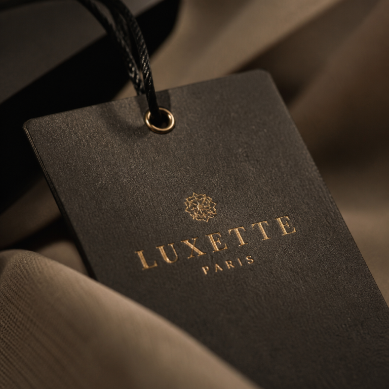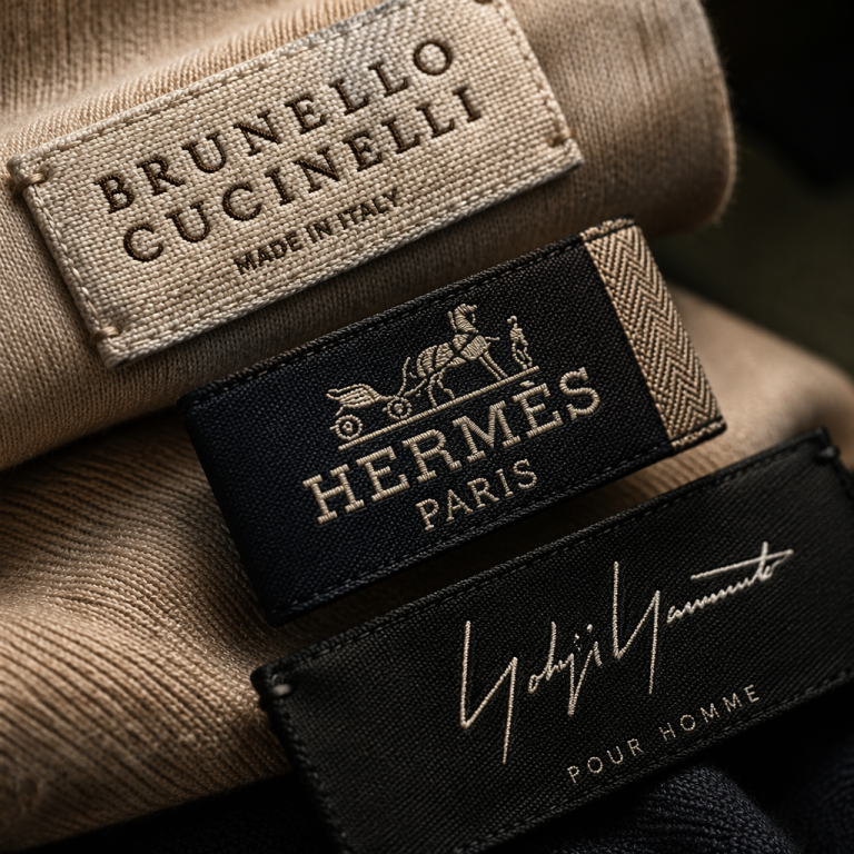
I was in a sunlit showroom just off Via Montenapoleone last month, running my fingers along the collar of a new-season double-faced cashmere coat. The hand was impeccable — the kind of fluid, weighty drape you expect from a Loro Piana or a Brunello Cucinelli. But what stopped me was the label. Not a stark, geometric block of sans-serif letters printed on satin, but a softly frayed, densely woven tag with a revived italic serif logotype and a single, hand-stitched thread border in a tonal ecru. It didn’t announce. It whispered. And that whisper carried more confidence than any logo plastered across a chest ever could.

That moment in Milan crystallised what I’ve been observing across dozens of designer ateliers, trade fairs, and boutique walk-throughs this year: the luxury clothing label is entering a new design cycle. After a decade of uniform minimalism that flattened even the most storied logos into interchangeable sans-serif wordmarks, 2026 is shaping up as the year heritage, craft, and detail physically reappear on the inside of garments. For independent fashion founders and boutique labels, this shift isn’t just an aesthetic novelty—it’s a strategic tool. The clothes might do the heavy lifting on the rack, but the label is increasingly the closing argument on the dressing-room floor.
The End of Logo Sanitisation
You’ve seen the charts: over the past three years, as reported by BoF and McKinsey, 80% of luxury brand growth came from price hikes, not volume. Houses pushed five-figure handbags and hyper-expensive ready-to-wear while quietly stripping their identities down to the barest marks—what the industry now calls “blanding.” Burberry dropped its equestrian knight for a sterile geometric typeface. Balmain, Berluti, and even Saint Laurent flirted with the same rigid anonymisation. The logic was digital legibility: a logo that works in a tiny app-store tile or an Instagram profile picture. But by 2025, a reckoning had set in. Consumers with real spending power—the ones who fund the top 5% of clients generating over 40% of sales—didn’t want to pay Gucci prices for a label that looked like a generic start-up.
The 2026 reset is unmistakable. At the latest resort presentations, I saw Gucci’s revisitation of its serif heritage on internal garment tags, woven with slightly raised chenille thread. Bottega Veneta, which famously deleted its social media and turned its iconic intrecciato into a label motif, is rumoured to be reintroducing an archival script on made-to-order pieces. These aren’t retro retreads; they’re reimagined identity marks that use materials—linen, silk organza, uncoated cotton tape—to add a haptic dimension. The flat, digital-first logo is ceding ground to the label you want to touch.
Tactile Storytelling
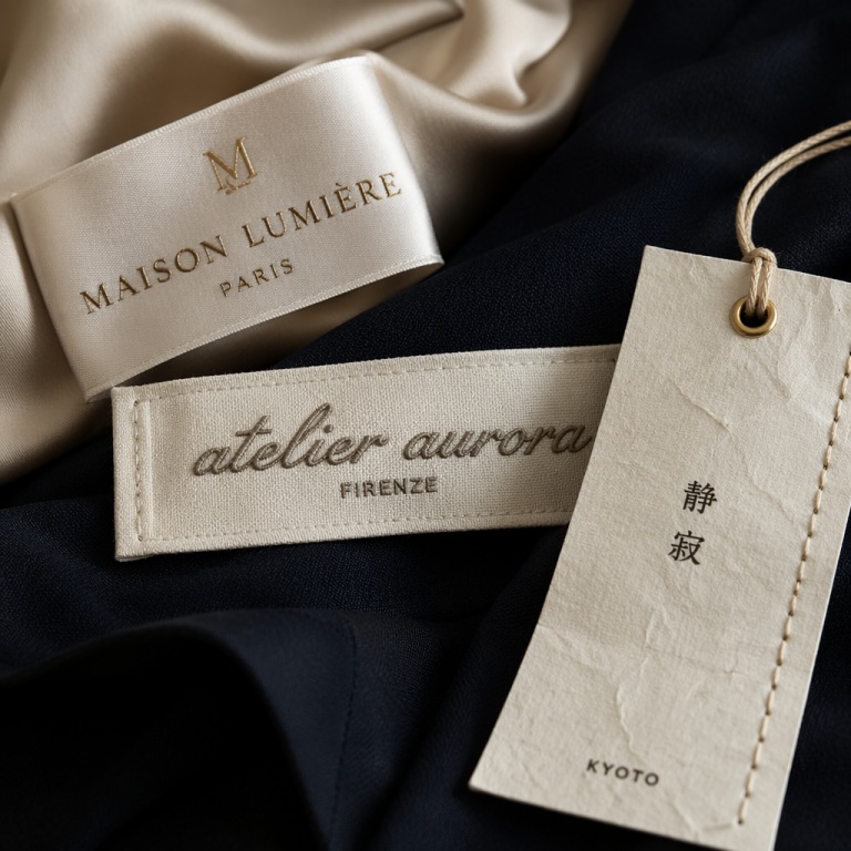
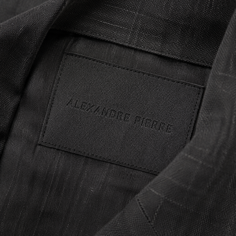
What makes a clothing label feel luxurious in 2026 isn’t size or flash. It’s the precise opposite: restraint married to material intelligence. I’ve spent the better part of a month analysing newly delivered samples, and three tactile trends have quietly overtaken the old satin-print norm:
- Milled edges and raw hems. The row and Khaite have been using labels cut from deadstock shirting fabrics with lightly frayed edges, giving them the air of a personal tailor’s mark rather than factory output.
- Woven, never printed. Even at accessible contemporary price points, brands like Toteme and The Frankie Shop are switching from silicone screen-printed care labels to fine-woven damask tags. The tiny basket weave under a contrast thread logo reads as generosity, not cost-cutting.
- Emboss and deboss on leather. For outerwear and denim, the leather patch is back—but not the glossy, stamped version of 2005. Think vegetable-tanned, debossed sans ink, or blind-stamped in the manner of Hermès’ saddle leather. I recently found a stunning example on an oversized blazer from a small Neapolitan tailoring house: a cognac horsehide strip with the house name simply pressed in, held by two tiny hand stitches.
These choices aren’t decorative afterthoughts. They form a physical brand manifesto. In a market where customers are scrutinising construction, inner labels are becoming the ultimate litmus test of a designer’s commitment to quality. A beautifully irregular selvage edge on a label signals that someone cared enough to source mill-end fabrics and finish them by hand—the same logic that persuaded me, years ago, to trust a brand that lined their pockets in raw silk.
Heritage as a Moat
When I speak with brand founders about identity for 2026 and beyond, the conversation rarely stays on aesthetics for long. It quickly moves to moat-building. With ultra-fast fashion dupes and “quiet luxury” mass-market knock-offs flooding the market, a truly distinctive garment label—woven in an artisan mill in Como, printed with a revived family crest, or finished with a hand-knotted thread—becomes an uncopiable signature. Dropout recently reported that counterfeiters are now scanning labels in high resolution to reproduce them within weeks; a sensory, textural label that relies on touch and material rather than just visual design is exponentially harder to fake.
Several heritage houses are doubling down on this. Brunello Cucinelli has long used its hand-written “Solomeo” tag stitched into each garment as a quiet badge of origin. In 2026, I expect more mid-size labels to follow suit by reviving archival lettering, commissioning custom typefaces from foundries, and telling the story of their own provenance right on the inside back neck. Even a small batch of shirts produced in a London workshop can carry a tag that mentions the tailor’s name or the county of the cotton. That specificity is the opposite of bland. It turns the label into a miniature certificate of authenticity.
I saw this done brilliantly by a young Florentine womenswear designer who embroiders the geographic coordinates of her grandmother’s atelier onto each care label. It’s a tiny, secret detail that guests at her trunk shows point to and say, “This is why it feels different.” In a digital sea of sameness, those intimate, heritage-rooted signals become the entire brand.
The Strategy Behind the Stitch
It would be a mistake to view these label trends as purely aesthetic. They’re mirroring a deeper strategic recalibration that the luxury sector has no choice but to undertake in 2026. After a punishing post-pandemic hangover—overexpansion, erratic creative director turnover, pricing that outpaced value perception—fashion houses are being forced to reset.