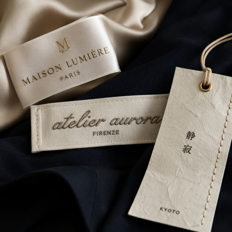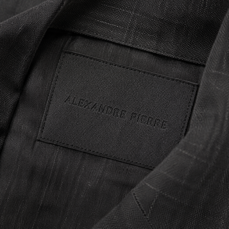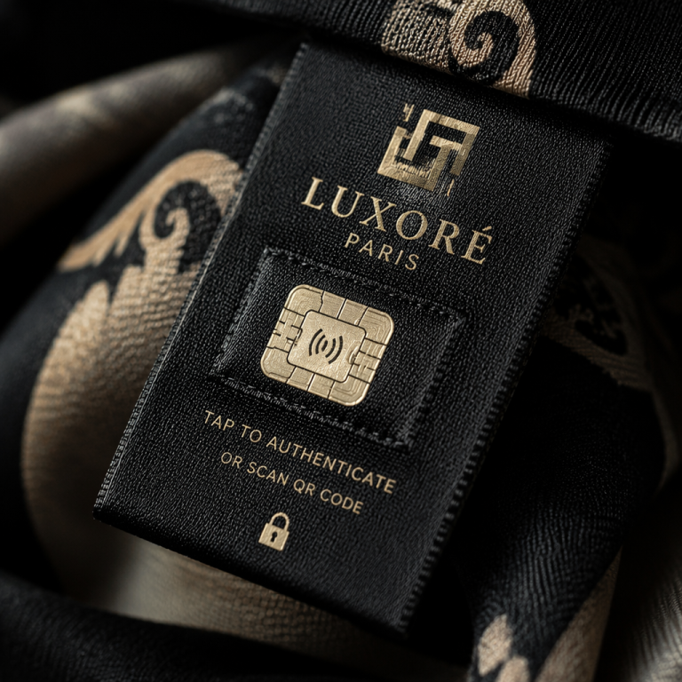
I was unpicking the collar of a vintage blazer the other day—half curiosity, half salvage mission—and there it was. A woven label, barely an inch across, with a name I’d never heard of, stitched in tiny, precise letters. The threads were still crisp, the sheen just so. It stopped me cold. In a world of printed tags that crack and fade after a few washes, this little rectangle felt permanent, intentional. It whispered something about the garment that the fabric alone couldn’t. And I thought: this is why we obsess over labels.
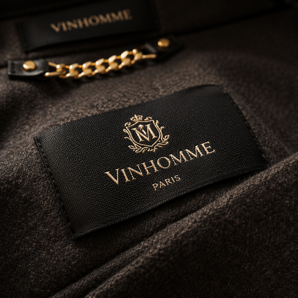
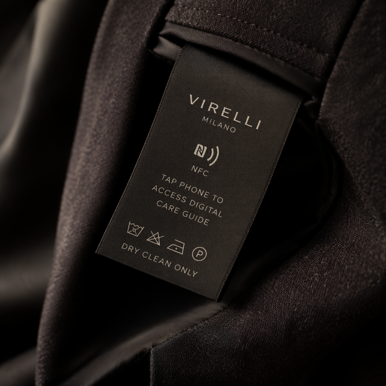
For those of us building clothing brands, the label is too often an afterthought. We fuss over fabric weight, stitch tension, the perfect shell button—then slap on a generic printed satin tag. But that final hardware? It’s the handshake. It’s where the customer’s fingertips land when they slip into a coat or reach back to check the size. A woven label, especially a finely woven damask or a soft taffeta, transforms that momentary touch into a quiet statement. It says, “We cared enough to weave our name into this, not just print it on.”
The Craft That Makes the Difference
Not all woven labels are created equal, and once you’ve held a proper damask, you can’t unsee it. Damask weaving uses ultrafine threads and a high-density loom—think 100 threads per inch or more—to build the design directly into the cloth. The result is a label that feels almost like a miniature tapestry. You get crisp, hairline serifs, subtle shading, even that elusive “satin sheen” that shifts under the light. I’m thinking of brands like Margaret Howell or the Japanese label 45R; their woven labels aren’t loud, but they’re unforgettable. They sit against the neckline like a signature, not a billboard. That’s the kind of branding that works on linen shirts and cashmere knits alike—unobtrusive, luxurious, durable.
Contrast that with a basic satin label where the text looks a bit blocky, or worse, begins to pill after a season. On a fine garment, a cheap label feels like a fake smile. It’s jarring. But when the label has weight and texture, it becomes part of the tactile experience—like the selvedge on raw denim, or the gleam of a real mother-of-pearl button. It invites touch. And in fashion, if you can make someone pause and touch, you’ve already won half the battle.
A Tip for Designers: Play with Tone and Texture
Here’s something practical I’ve learned from years of sourcing. When you’re designing a custom woven label, don’t just default to black on white. That can look stark, almost clinical, on a garment meant to feel soft or earthy. Instead, try a tonal palette: dark navy thread on a midnight blue ground, or ivory on ecru. The label will catch the light differently, revealing the design only up close—like a secret. And pay attention to the thread density. If your logo includes delicate details (thin lines, small serifs), you’ll need at least a 60-thread-count damask to keep it sharp. Sacrifice a bit of size if you have to—better a tiny jewel than a blurry stamp.
Another texture trick: request a “merrow” or slit-edge finish rather than a flat cut. That tiny border adds a handcrafted, old-school feel that customers notice. I’ve seen this on slow-fashion pieces from brands like Elizabeth Suzann—label edges that are subtly scalloped, as if someone took the time. Because someone did.
The Quiet Rebellion of Permanence
I think we’re craving things that last. A woven label ages gracefully: it softens, but it doesn’t disappear. The threads might get a little fuzzy with wear, but the design remains legible year after year. That kind of durability sends a message. It’s the brand whispering, “We made this to be kept, not tossed.” In an era of fast everything, that whisper is getting louder. A truly premium label isn’t just a branding tool—it’s a promise sewn in.
So next time you’re sampling a collection, hold a woven label up to the light. Feel its weight. Think about the hands that will find it months after purchase, maybe in a vintage shop years from now. That tiny rectangle of thread might just be the most honest part of the whole garment.