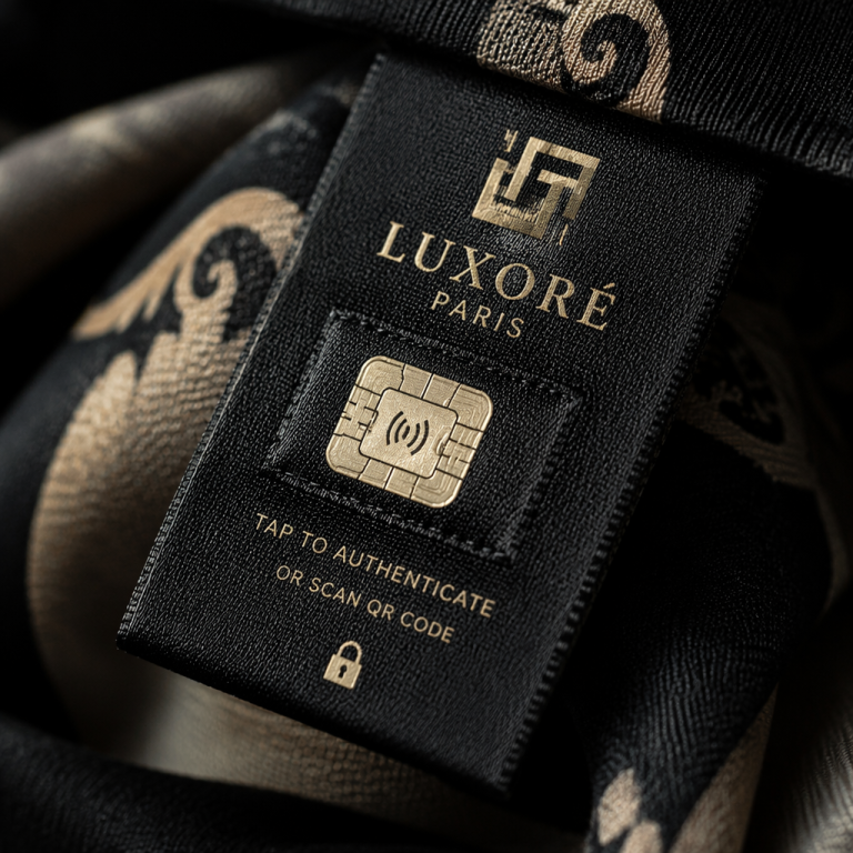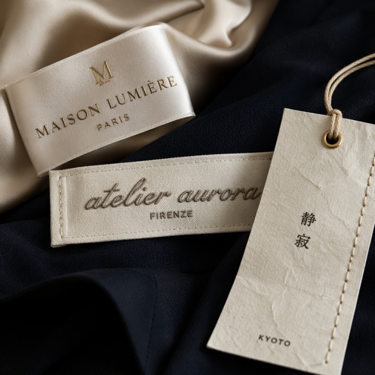
I still remember the first time I held a label that made my fingers slow down. It was a tiny cotton tag inside a vintage Yves Saint Laurent blouse—no logo, no motif, just a slender serif spelling out “rive gauche” in dark blue. The letters floated with so much air and intention that the brand felt less like a corporation and more like a whispered secret. In a world obsessed with icons, that label reminded me: typography is the silent ambassador of your brand. It doesn’t shout—it hums. And if you’re designing clothing labels, that hum is everything.
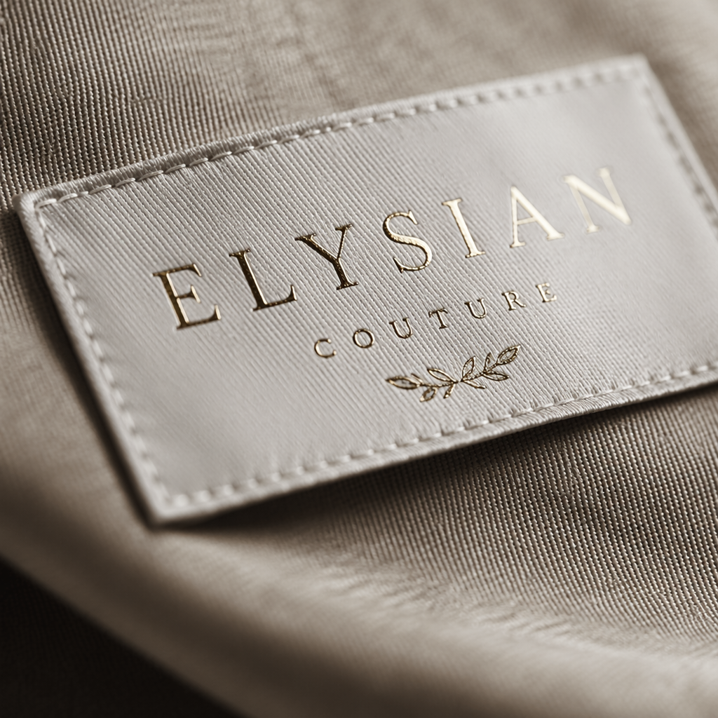
The Font Comes Before the Flash
A lot of designers I meet worry first about colors, logos, or whether to foil-stamp. They’ll sketch a pretty symbol, then grab whatever font sits at the top of their menu. But here’s the thing: when someone unpacks your garment, the type on the label is the first tactile thing they read. It sets the whole sensory expectation. I’ve seen gorgeous silk dresses cheapened by a heavy, generic sans-serif that screamed “sportswear outlet.” And I’ve seen basics elevated to something covetable simply because the woven label used a transitional serif with a tall x-height and delicate bracketing. That’s not snobbery—it’s just how perception works.
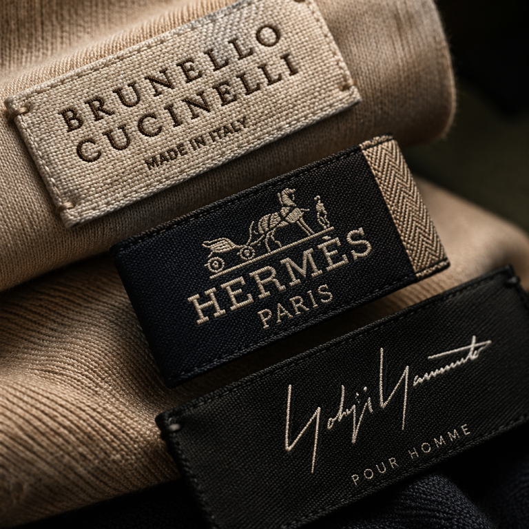
Luxury typography rarely tries to impress. It rests on proportions that feel second nature, like the best tailoring. Chanel’s custom sans-serif appears so simple you’d swear any clean geometric font could do it, but look closer: the slightly condensed letters, the wide spacing, the capital-only restraint—they echo the architectural precision of a suit jacket. Loewe goes a different route with a chunky embossed anagram, but right beneath that, their product labels use a crisp, modern serif that feels like a gallery caption. Both understand that the job of a luxury font isn’t to scream “expensive.” It’s to create a kind of pause.
Stealing Secrets from the Big Names (Without Copying)
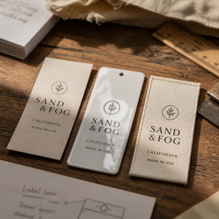
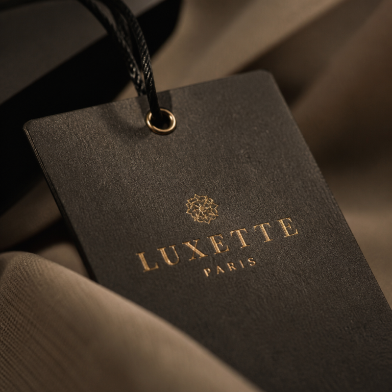
When I consult with independent designers, we don’t copy these houses—we dissect what makes their type feel assured. It usually comes down to three things: proportion, restraint, and material harmony. Typography on a paper hangtag has different rules than on a woven label. A font that looks elegant on screen can turn into a muddy mess when threads replicate it. Luxury brands often commission custom typefaces so the weight, spacing, and even the texture match the fabric. You might not have that budget, but you can hunt for fonts that were originally designed for small print, or you can work with a typographer to tweak an open-source face.
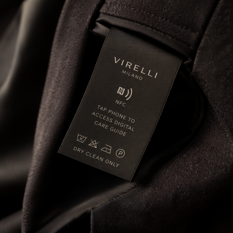
What you should never do: let the font be an afterthought. I’ve watched a label where the letters were so compressed that the “a” and “o” almost sealed shut after a few washes. The brand looked careless, not minimal. The Row gets revered for its spartan aesthetic, but that tiny, elegant sans-serif on their care labels—usually in a muted grey ink—feels like a well-bred nod. It’s deliberate. Quiet luxury is in the details that nobody notices until they’re done wrong.
A Practical Tip: Start with Spacing, Not the Typeface
Here’s something you can use this afternoon. When you’re testing fonts for a clothing label, stop staring at the alphabet parade in a dropdown. Instead, open a blank document, type your brand name, and set the tracking (letter-spacing) to 100, 200, 300—way wider than default. Print it at the exact size your label will be. How does the air between letters breathe? Do the counters of your “e” and “a” still hold their shape? Luxury typography lives in that generous white space. A perfectly respectable font turns clunky when letterforms crowd each other on a woven ground. Try pushing the spacing until the word almost feels architectural, then pull back just a hair.
And if you’re using a single color on a textured material, check for optical shrinkage. White lettering on a dark cotton tape will appear heavier than black on cream because the ink or thread can bleed. I often tell designers to go one weight lighter than they think they need, then order a sample. Labels aren’t screens; the fabric eats some of the crispness, and that patinated softness can be a feature if you design for it. This one practice—obsessive spacing tests at real size—separates the labels that look “handmade” from the ones that look handmade with love.
Ultimately, the font you choose for your label is a promise. It says whether someone should expect meticulous stitching, natural fibers, and a point of view—or just a garment that meets the minimum. You don’t need to be Chanel. You just need to care enough that the first thing a customer reads, in that tiny intimate space inside a collar, feels like you. Because luxury, at its core, is just attention paid to the quietest parts.