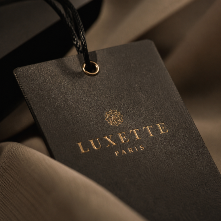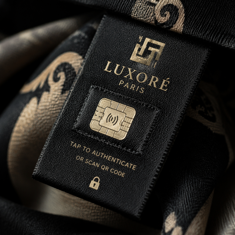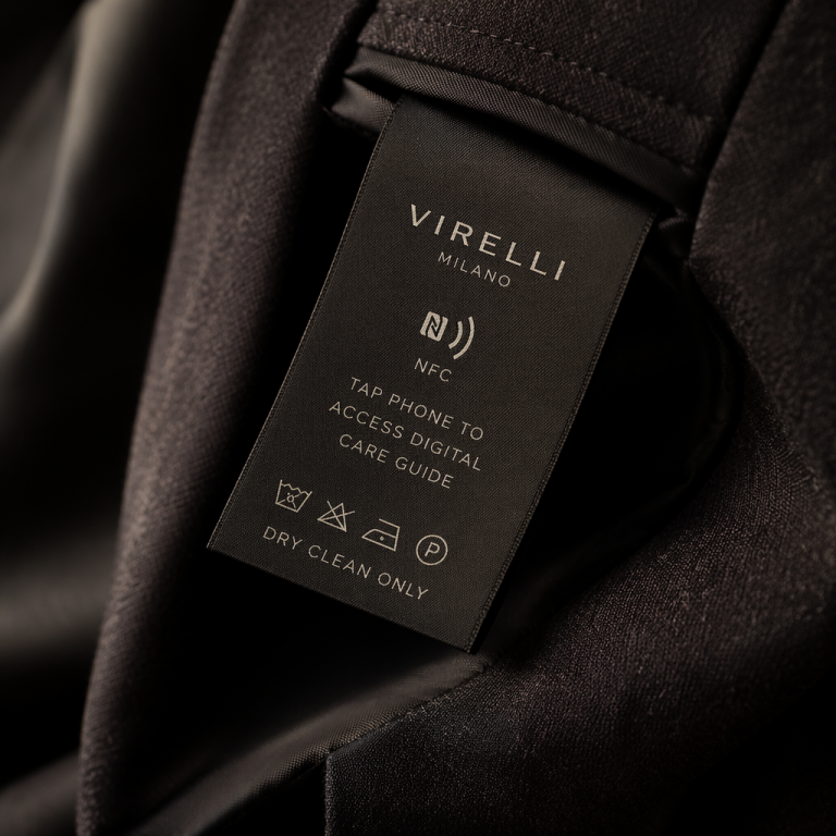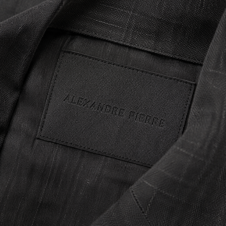
I was in a tiny Aoyama boutique last autumn, the kind where the awning is so discreet you’d miss it if your map didn’t tremble. Inside, a single rack of deep indigo jackets hung like a silent meditation. I turned one inside out—a habit I can’t shake—and found the label: not chain-stitched, not printed grosgrain, but a rectangle of handmade washi paper, its edges deckled, the brand name letterpressed in a shade of ink so black it seemed to pull light into itself. The seam holding it in place was a visible running stitch of ivory silk thread, each stitch a tiny, deliberate declaration. I thought of the hand-embroidered label I’d seen weeks earlier inside a Brunello Cucinelli blazer in Milan, its cursive logo warm and slightly irregular, and of the sharp, perfect satin tag inside a Chanel jacket in Paris, its letters woven with a crystalline precision that felt like a secret handshake. In that moment, I realized that a clothing label is not just compliance or branding—it is a nation’s philosophy of making, shrunk to a sliver of fabric. Japanese, French, and Italian luxury each hold a unique conversation with craftsmanship, and you can read it in the very labels they stitch into their garments.
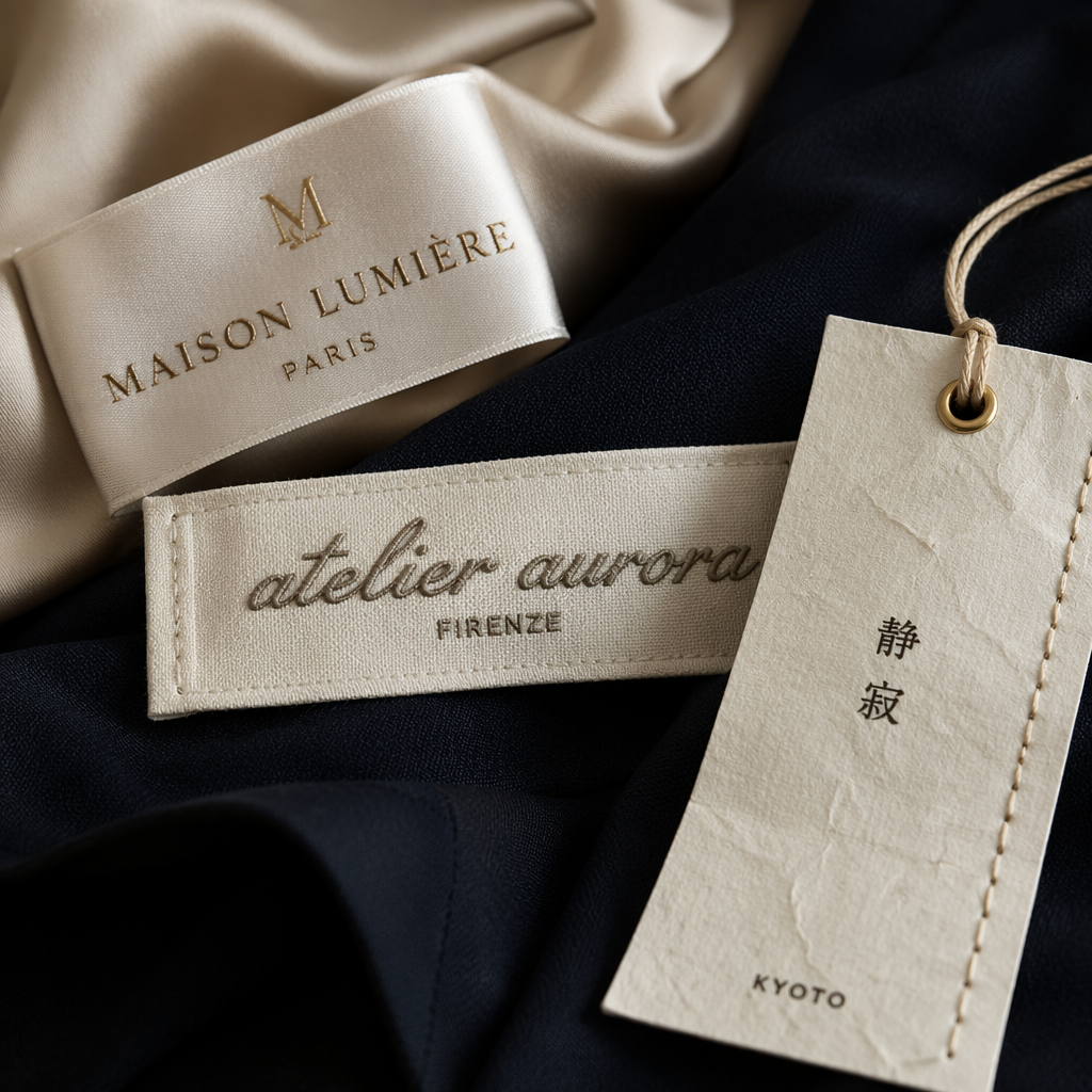
The French Atelier: Architecture in Every Thread
French luxury is built on the cult of the atelier—the hierarchical, highly codified workshop where skill is protected like a state secret. When I visited a small leather goods supplier outside Paris, the owner showed me how their labels are woven in Lyon on Jacquard looms that have been running for nearly a century. The thread count is so dense that the brand name reads like engraved whisper, never a shout. There’s a reason Hermès still employs in-house label weavers: a brand tag is a miniature tapestry, and in the French mind, it must be perfect to the point of detachment.
This isn’t about coldness; it’s about institutional gravitas. French fashion houses from Dior to Louis Vuitton treat the label as a seal of legitimacy. The typography is often serif, referencing engraving or lettres de cachet from the 18th century. A Saint Laurent woven label, for instance, uses a precise sans-serif that feels drawn by a modern architect—again, controlled, deliberate. The stitching attaching it is almost always machine-made, ruler-straight, often tucked behind the label edges so you never see a wandering thread. The message: “We are a house, not a person. Our craft outlives us.”
The Anatomy of a French Luxury Label
- Material: high-density woven polyester or silk-satin, often loop-type (where the design is woven from one continuous thread). Feels smooth as cold porcelain.
- Typography: classical serif (Didot, Bodoni) or extremely refined sans-serif (think Céline’s old logo). Never playful.
- Attachment: fully concealed or single-needle edge stitching, often in a matching color. The tag should seem to float.
- Care labels: printed on soft polyester with exhaustive, legally bulletproof instructions. Sometimes even the care symbols have a bespoke feel—Hermès uses a gentle hand-drawn icon set.
For independent designers studying this code, the lesson is that restraint is a luxury indicator. A French-inspired label doesn’t need to scream; it needs to feel inevitable, as if it were carved into the garment’s DNA. When I consult with brands aiming for that Parisian reserve, I often advise sourcing woven labels with a matte finish and specifying a thread-color match that’s one shade lighter than the ground—it creates the ghostly, just-barely-there effect you see inside a Khaite blazer.
Italian Mano: The Romance of the Human Hand
If a French label is a formal handshake, an Italian one is a warm, lingering clasp. Italian luxury has always rooted itself in mano—the hand—and in the idea that a beautiful thing should seduce you on a sensory level before it impresses you intellectually. This philosophy bleeds directly onto the care label and brand tag. I remember turning over a Loro Piana cashmere sweater in their Via dei Condotti store and finding a small, hand-sewn brand patch in nubby raw silk, its edges gently frayed as if to say, “I am made of nature, and I am not afraid to show it.”
Brands like Brunello Cucinelli, Bottega Veneta, and Zegna don’t just label their garments; they caress them. The embroidery on a Bottega brand tag often uses a thick, matte thread that mimics the house’s intrecciato weave, stitched by artisans in the Veneto who press each patch with a warm iron until it becomes one with the fabric. There’s a deliberate irregularity—a tiny tilt to the logo, a hand-cut edge—that telegraphs “this was made by someone who loves me.” It’s the polar opposite of the French institutional chill.
Italian craftsmanship organizes itself around a uniquely decentralized system: clusters of family-owned ateliers in Lombardy, Tuscany, Veneto. This network fosters a certain sprezzatura even in labeling. A Brioni suit might have its brand tag attached with a hand-stitch pick-stitch in a contrasting color, a tiny flourish that nods to the sartorial tradition. The care labels, often printed on a slightly textured cotton, feel like old-world stationery. When I work with Italian fabric mills on custom labels, they invariably propose a solution with a tactile surprise: perhaps a flocked velvet surface, or a subtle deboss so you can feel the logo with your eyes closed.
The Signature Moves of Italian Label Craft
- Materiality: expect raw silk, linen-cotton blends, soft nappa leather patches, or brushed felt. The touch is everything.
- Embroidery: chain-stitch or satin-stitch logos, often hand-guided. The slight unevenness is the point—it proves a human held the needle.
- Color: earthy neutrals (ecru, taupe, sand) but also surprising saturated jewel tones in the stitching (a crimson logo on a tobacco background, for instance).
- Hang tags: heavy cotton paper with a laid finish, attached with natural twine or hand-cut leather cord. Often embossed with a crest or a blind stamp.
For boutique owners and emerging designers, the Italian approach is a masterclass in emotional warmth. If you’re designing eveningwear or luxury knitwear, consider a brand label in soft cotton twill with hand-embroidered lettering—even if you have to start with a small artisanal workshop. I’ve seen a London-based cashmere brand triple its perceived value simply by switching from a woven satin tag to a hand-felted wool patch with a single-needle running stitch. The customer didn’t articulate it, but they felt held.
Japanese Shokunin: The Silence of the Infinite Detail
Japanese luxury craftsmanship operates on a frequency that many Western brands miss entirely. At its heart is shokunin, a word that translates poorly as “artisan” but really means a person who dedicates their life to a single, finite practice until it becomes a kind of spiritual dialogue. In fashion, this translates to labels that feel less like branding and more like an invitation into a worldview. Return with me to that Aoyama boutique: the washi paper label existed not to announce a brand name, but to complete a garment’s character. The paper was made from mulberry fibers by a tenth-generation papermaker in Kochi; the thread was hand-dyed with natural persimmon tannin. The label was integral, not appended.
Japanese designers—from Rei Kawakubo of Comme des Garçons to Hiroki Nakamura of Visvim—treat every label choice as an extension of the textile narrative. A Visvim jacket might have a label that’s a tiny piece of the same indigo-dyed selvage denim used in the garment itself, screen-printed with a sacred geometry symbol. Undercover